Bar Corso
Web Design & Art Direction
Reimagined the digital experience to eliminate navigational friction and fragmented user journeys. By architecting a seamless, intuitive interface, the new platform reflects the restaurant’s core values—elevating the brand from a static site to a functional extension of the physical dining atmosphere.
Problem.
The old site’s navigation created friction and fragmented the guest’s journey online.
Solution.
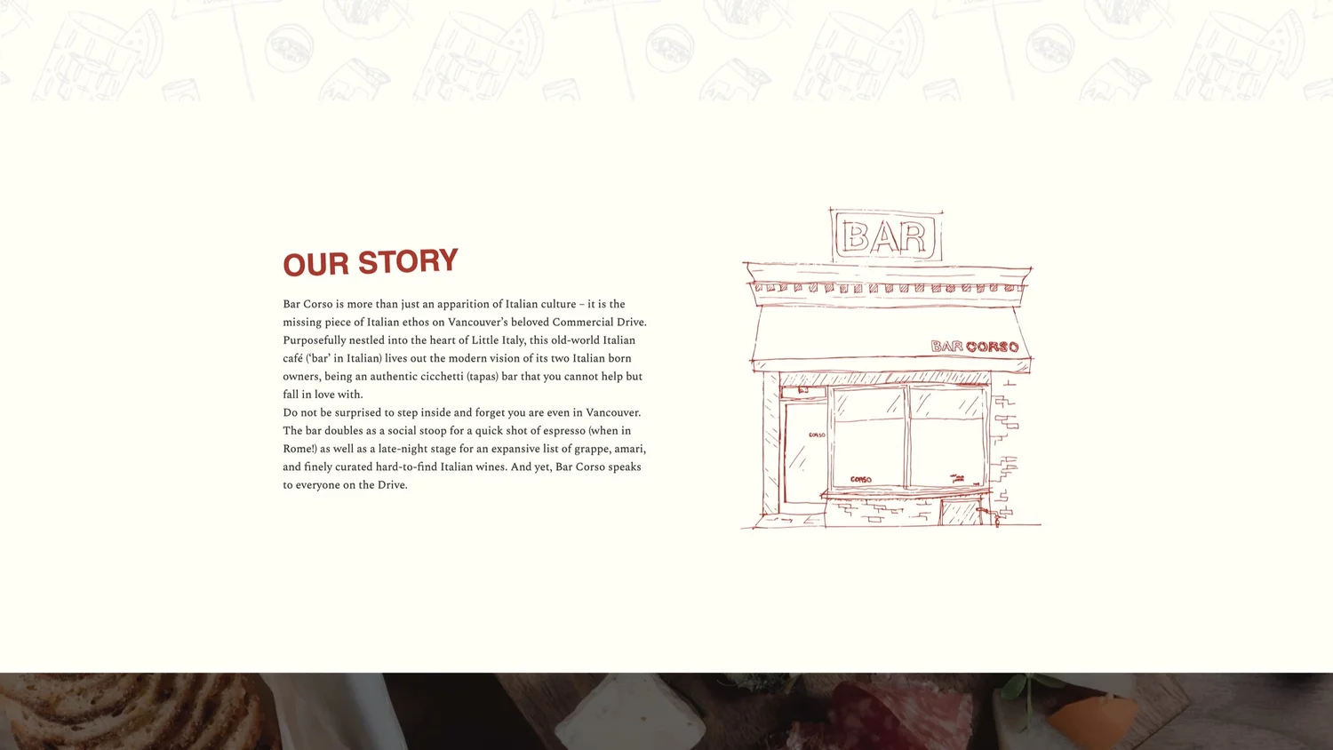
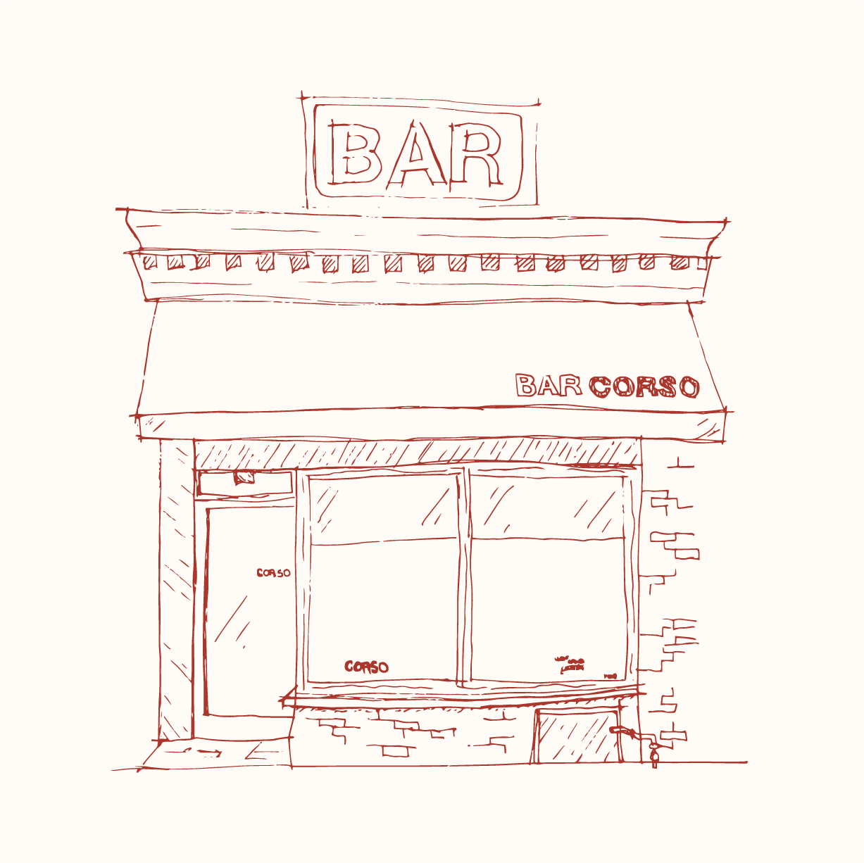
An intuitive interface, anchored by custom late-modernist illustration, that extends the dining atmosphere to the web.
Objective
The aim is to create a website that enhances the user experience by providing easy navigation and understanding. The website must effectively communicate Corso’s brand narrative by adding more layers of depth to its current assets.
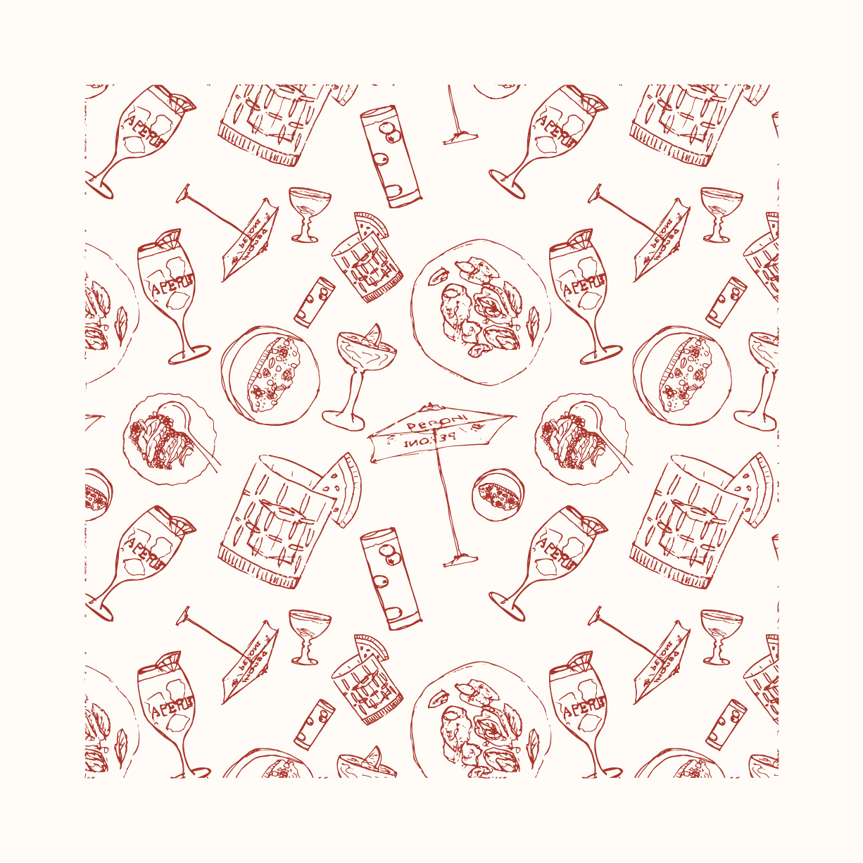
Illustration
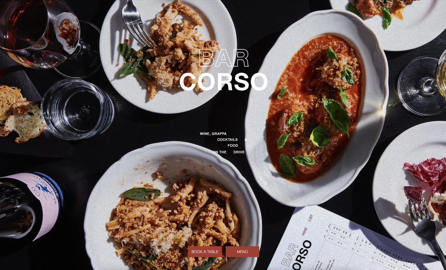
Desktop Home Page
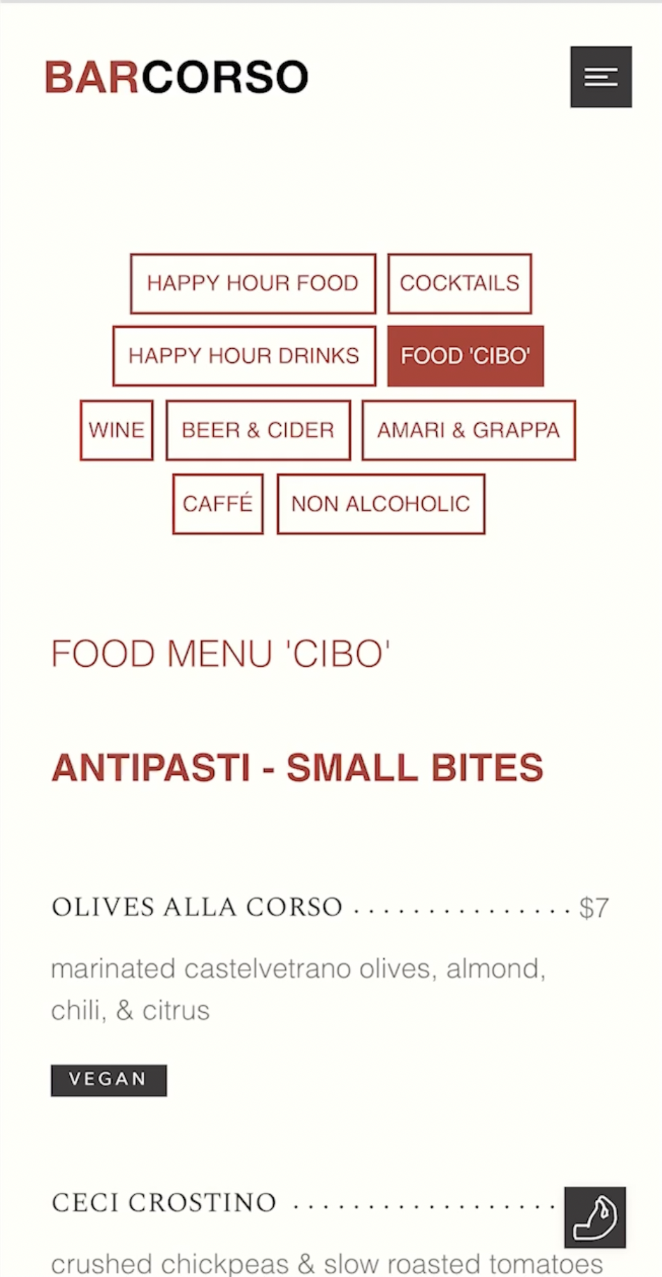
Mobile Menu
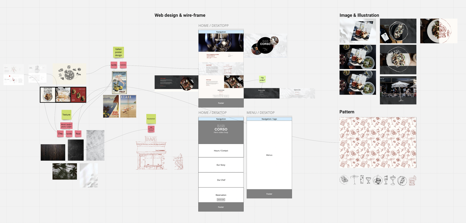
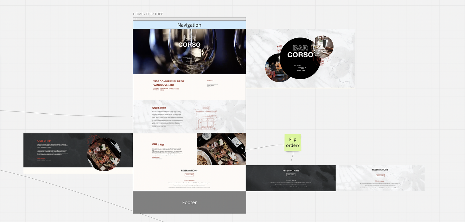
Selected Process
Early Miro boards depicting overall structure and style.
Initially, the plan was to incorporate photorealistic textures to anchor the illustrations in reality. However, this approach resulted in the design drifting too far away from its original inspiration—the late modernist and Swiss design principles reminiscent of the Italian ski posters from the 1980s.