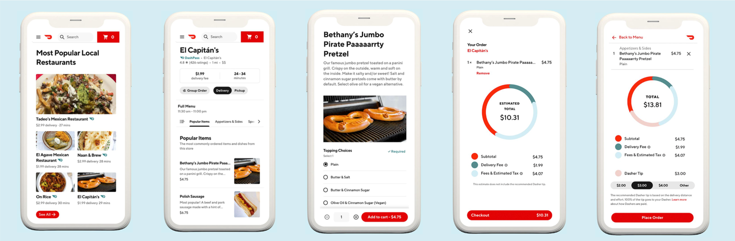
DoorDash Checkout
UI
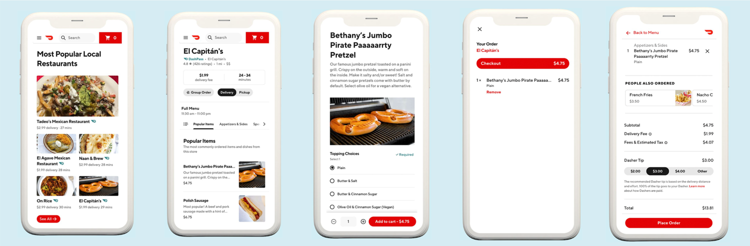
The current DoorDash checkout process poses a challenge for users to comprehend the fees being charged and lacks transparency in terms of where their money is being utilized. As a result, users may feel uncertain about the value of their investment and are left with little reassurance.
Problem.
Checkout fees are opaque, leaving users unsure what they’re actually paying for.
Solution.
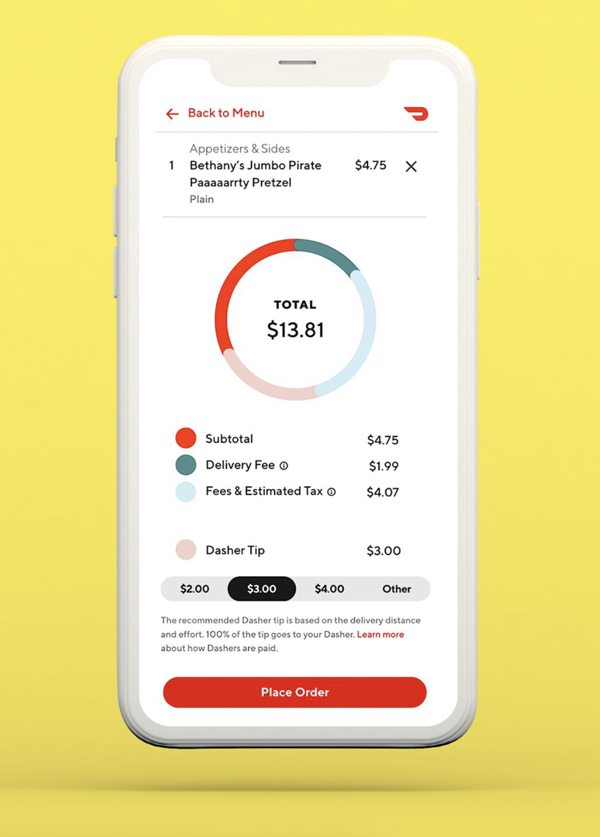
A visual fee breakdown inside the familiar checkout flow, showing where each dollar goes.
Challenge
The current DoorDash checkout process poses a challenge for users to comprehend the fees being charged and lacks transparency in terms of where their money is being utilized. As a result, users may feel uncertain about the value of their investment and are left with little reassurance.
How Might We?
Create a more transparent payment system for users ordering food and Ease users into the final price of their order without disrupting the existing user flow?
User Flow
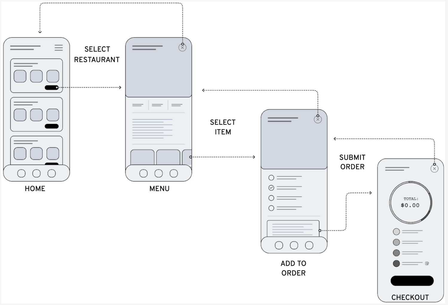
While keeping a familiar user flow for consistency, it was important to enforce where the user’s money would go to justify that their funds are used appropriately and in a way that is ethical for the Dasher, Restaurant, and Doordash itself.
Solution
Add a visual breakdown of fees so users feel informed about where their money is going.